It is certainly possible to divide humanity into two distinct categories based on how they view a book: those who see it only as the necessary medium for the transmission of a text are called “readers”, while those who look at the book itself, the book-object, as a bearer of historical and aesthetic values, are called “bibliophiles”.
Bibliophilia presupposes an almost fetishistic relationship with the book: the frantic search for first editions, the pleasure of flipping through the brittle pages of ancient texts, the appreciation for the beauty of bindings, and the hunt for limited editions. There are many factors that contribute to making a book a masterpiece in its genre, and among these, the beauty of the typefaces plays an essential role.
The art of designing, engraving, and casting typefaces coincides with the very birth of the printed book.
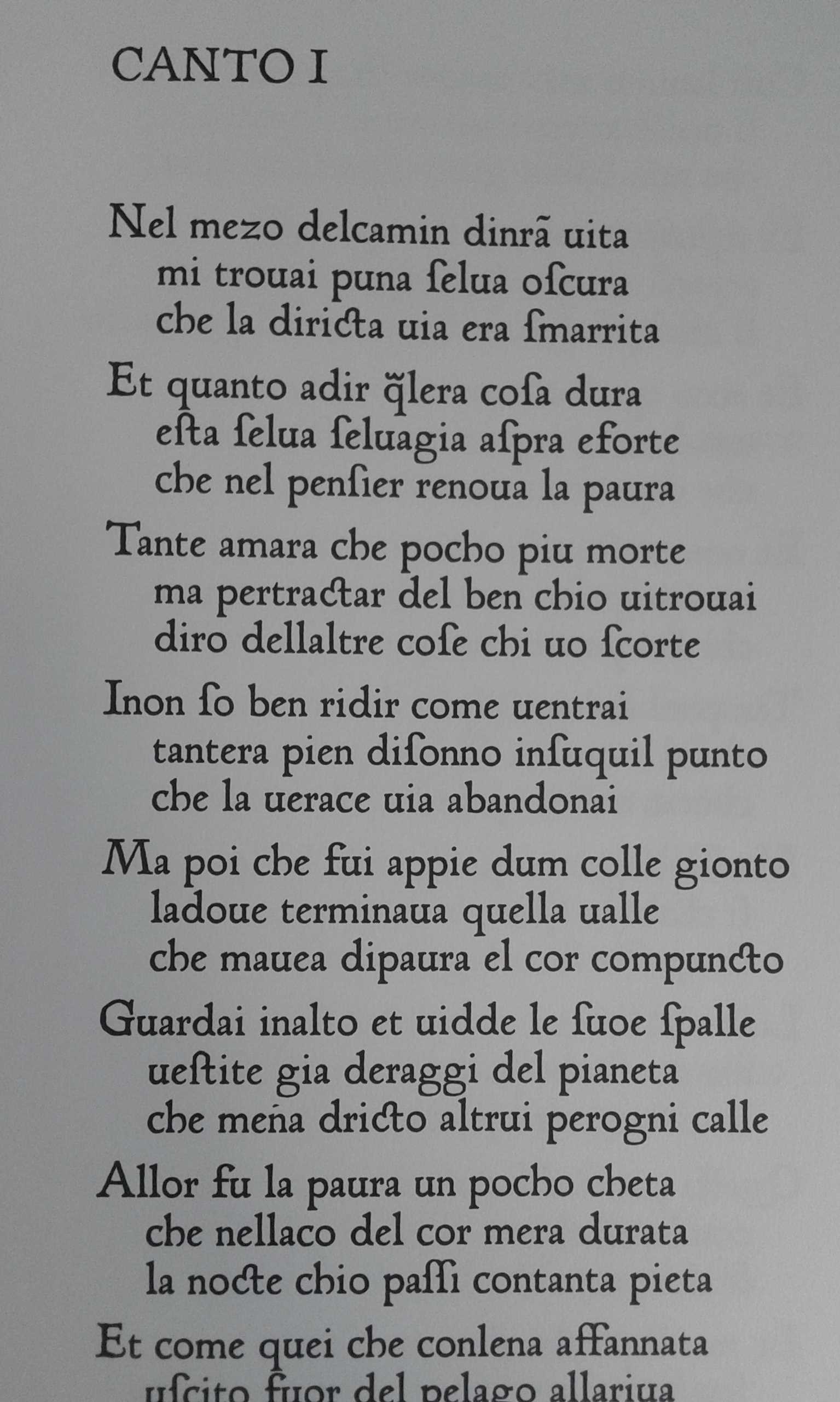
At first, manuscript characters were imitated; a significant example of this phase can be seen in the splendid Treccani edition of the Divine Comedy (illustrated by Doré, reinterpreted by Ernesto Treccani), available in our catalog: the poem is printed by reproducing the text and characters used by Neumeister and Angelini in 1472 in their printing press in Foligno for the first and historic printed edition of the Poem.
Soon, the spirit of Renaissance research also embraced the debate on the design of typefaces: between the mid-1400s and early 1500s, humanists, mathematicians, and typographers questioned the design and proportions of printed letters, in search of that “divine proportion” described by Luca Pacioli in his famous treatise.
But the beauty of a typeface is not only a matter of mathematical proportions: in the creations of the great masters of this art serving the printed word, the touch of genius and the inspiration of the artist are unmistakable.
Among these greats, there is an entire Italian tradition that spans centuries: we attempt to account for it through the work of four great artists who have accompanied us from the 16th century to the present day.
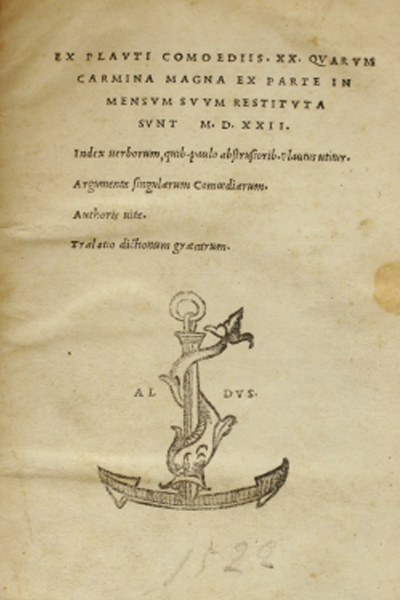
From the Venetian printing house of Aldus Manutius, with its title pages marked by the anchor and the dolphin, typefaces of unparalleled beauty and readability spread across the world: the Bembo of *De Aetna* from 1496, but especially the italic designed by goldsmith Francesco Griffo, which first appeared in the 1501 edition of Virgil’s works, and of which our library has an important example in the collection of the 20 Comedies of Plautus from 1522 (*Ex Plauti Comoediis XX Quarum carmina magna ex parte in mensum suum restituta sunt M.D.XXII*).
The history of Griffo’s elusive story, the true authorship of the type design, and the relationships between Francesco and Aldus have been the subject of much ink. What is certain is that the use of Aldus’ italic Latin, protected by one of the first copyrights of its kind requested by Manutius from the competent authorities of the Republic of Venice, would spark a lengthy legal dispute with the Giunti of Florence and with dozens of other printing houses that would copy this splendid and versatile typeface.
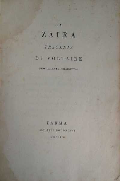
After the excesses of Baroque editions, the new neoclassical taste for cleanliness, elegance, and balance gave rise to research in printing houses all over Europe. In the “Royal Press” of the Farnese family in Parma, Giambattista Bodoni (1740-1813) synthesized in his figure as an artist/craftsman the skills of the punch engraver (the first phase of type design), the caster, and the compositor of the page. The Bodonian editions from the Royal Press are examples of that supreme purity of form that made the Parma presses the envy of all of Europe: travelers on the Grand Tour would include Parma in their itineraries to admire the frescoes of Correggio and visit the legendary press. Opening the pages of *La Zaira*, a tragedy by Voltaire, newly translated and printed in Parma in 1798, it is impossible not to recognize the Master’s hand in the unmistakable readability and harmony of the type, in the correct relationship between text and margins, between line and line, between letter and letter.


